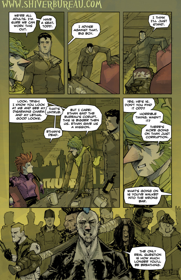
This week’s incentive for a vote is this page in ‘flats’ only mode. I think it is an interesting way to look a page layout. You just see the shapes as a composition. Really easy to see a success or a failure, I think.
Discussion (9) ¬
[ Comments RSS ]


This doesn’t look good for our heroes.
Your comic is brilliant, really loving it so far! That vote incentive was something else though. Do you normally block out your panels in rainbow colours? I ask because obviously those colours are totally unrelated to the colours you’ve got in your final work. Is it just for fun?
Thanks. As for the flats, honestly I don’t pay any attention to the colors I pick for flats. The first thing I do is block in each panel with a color. Then I start ‘cutting’ out the shapes in each panel, it is quicker to just slightly change the color of the panel instead of picking a new color. that is why each panel is monochromatic for the most part. I do this so I know each item will be a unique color. Once the flats are done, I never look at them again. So I don’t really care what they look like, I just want to make sure I don’t reuse colors. I know I keep promising to do a color video, but one day!
are bars really this effed up? I’m still a minor, so i wouldn’t know
There may be some bars out that you’d be better off passing by. Though maybe it is the ones with fancy trappings that you should really worry about.
Nice page dude. I read your technique in that comment you made. Man there’s more to making comics than pen and paper I see.
“Yes, he’s is” ?
Anyway, wonderfully detailed, atmospheric and creative art.
And where did all those blokes suddenly materialize from? I bet Pickles just got the most delighted smile on his face… like a child spotting the pile of Christmas presents in the morning.
great grammar there buddy
Thanks!